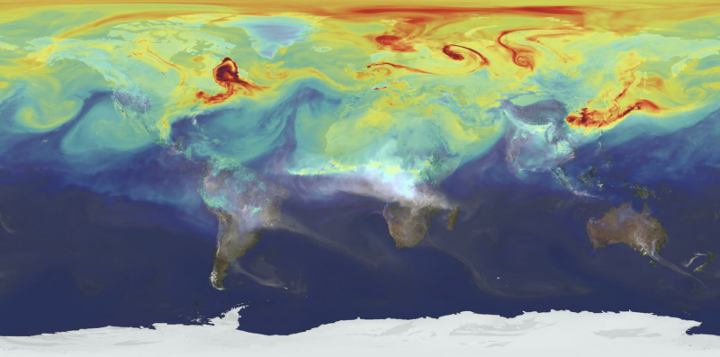
Heatmaps are used to map densities and intensities of a diverse phenomena that occur across the (geographical) space. This can be agricultural farms in Europe, penguin colonies in Antartica, spread of visitors in an Indian temple, or anything in-between. Density and intensity are different concepts. Let’s say that for a map of a single penguin colony each individual should count as one. However, if we map multiple colonies across an entire region, we may take into account the size of each colony; each point on the map will thus have a specific “intensity” or “weight” value (number of animals, surface, or similar).
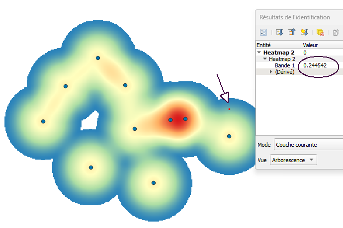
The quantity/intensity values are mapped using smooth colour gradients. It’s probably because of such smooth, diffuse appearance that the term heatmap became widely used. However, these maps are particularly difficult to interpret, even when they seem intuitively understandable. Let’s take a look at a typical case (below) – what does the value of 0.2445. stand for? Does it stand for a specific value under the chosen point ? or perhaps an amount of “energy” emanating from the neighbouring point ? The problem is that we cannot know at which scale either of these options may be valid.
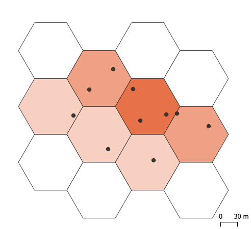
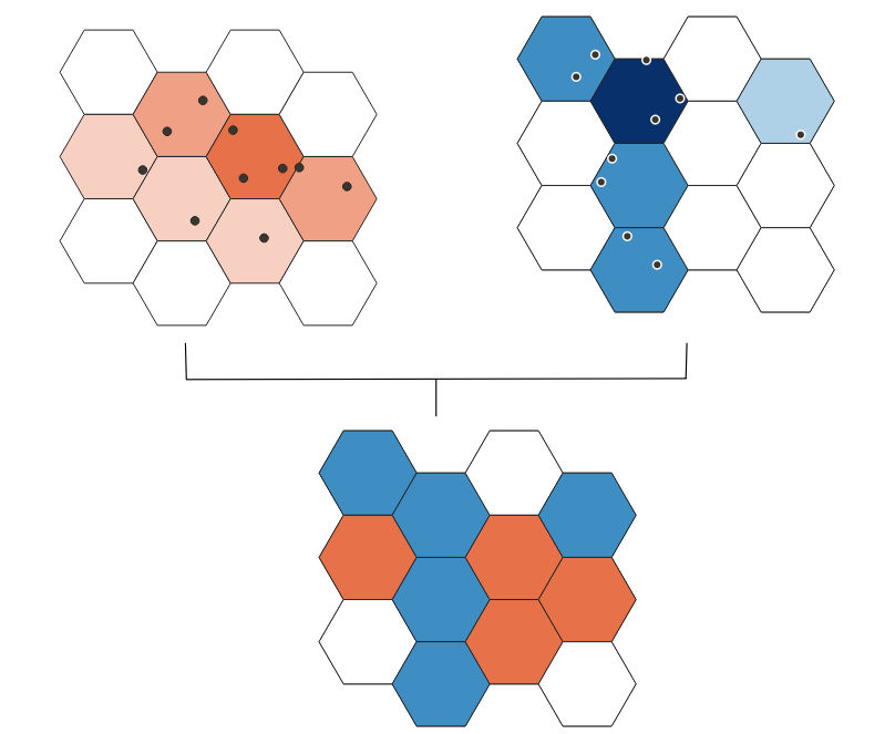
Let’s, then, take a look at a less handsome but (arguably) more understandable density map (below). Here, it is immediately apparent that colour values are valid for individual cells (the size of which should normally be indicated). Such gridded density maps are explicit on the size of spatial samples, i.e. on the scale of analysis. Turning to heatmaps, the extent of “smoothing”, let alone possible artefacts introduced by the smoothing procedure are very difficult to assess.
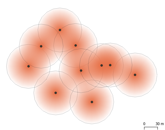
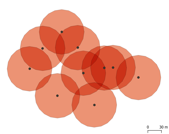
For these reasons, we need to understand the calculation method “under the hood”. Normally, a specific smoothing radius is applied around each point, with high values in the centre and low vales on the rim (Figure below). This is also known as kernel density estimation (KDE: see links below). Thus, a data point may count for 1 in the centre of the kernel, but will become 0.5 at halfway distance to the rim, and continue to decrease further away. This is where the bizarrely small values come from. We can also notice that zones of circle overlap may multiply the result to the extent that areas between data points would get a higher density value than the points themselves (darker colours). Heatmaps are nice, but also very messy!
Now, let’s take a step forward and try to compare two sets of density values. Perhaps our penguin colony grew in size between two points in time, and we would like to know which areas got the most of newcomers, and whether some areas got depopulated. This calculation is quite simple and unproblematic for gridded data: subtract two values for each cell, representing two penguin counts (provided, of course, that the grid remained the same).
Observe, however the complicated result obtained by subtracting two heatmaps, using the same data as above:
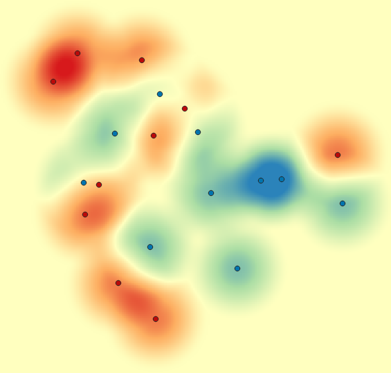
One could see quite a lot in such a map, even though a good deal of “patterns” arise from kernel artefacts. Again, the problem pertains to the spatial scale, namely the overlaps between the kernel zones, which produce small and irregular samples.
So, should I use heatmaps, or not ? Personally, I’m still fond of heatmaps, but they should always be presented with solid pedagogical caveats, which should prevent the public from reading random stuff into the visualisations.