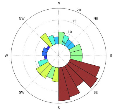
Orientation of geographic features can be an important piece of information, for instance when studying ancient field systems or analysing geological formations. The problem comes when we try to summarise such data graphically . Standard histograms are not ideal because they cut through the continuous distribution – one cannot easily understand the relationship between the beginning and the end of the diagram (which should stick together). Polar diagram is what we need, but it cannot be made without some fiddling around.
QGIS comes with great Matplotlib Python library for data visualisation (windows version at least) which can be tweaked in all imaginable ways (colours, offsets etc.). The following script is simply passing data to matplotlib, directions have to be pre-calculated beforehand. In other words you should have a table field with calculated directions. The same applies for the raster version – it works on an aspect raster where each cell stores an angular value.
The scripts can be downloaded at https://github.com/zoran-cuckovic/QGIS-scripts (search for “polar histogram”).
